Building a Modern Web Experience: From Bento Grid to Production-Ready Platform


Table of Contents
- The Starting Point
- Challenge #1: Building a Maintainable, Cost-Effective Architecture
- Challenge #2: Designing the Layout - From Blank Canvas to Personality-Driven Pages
- Challenge #3: Scaling Content Storage - From Git LFS to Cloud Infrastructure
- The Architecture Evolution
- Technical Decisions and Trade-offs
- What's Next
- Key Takeaways
It's 3:16 AM on a Wednesday night, and instead of getting sleep like a reasonable person, I've decided to completely rebuild my personal website. What started as a simple refresh has turned into a deep technical journey that taught me more about modern web development than I expected.
Let me walk you through the challenges, solutions, and lessons learned while building what became a production-ready content platform.
The Starting Point
My old portfolio site was everything I didn't want: static, bloated with boilerplate code, and failing basic security checks. I wanted something that felt like me — a place for silly projects, technical writing, and creative experiments.
The tech stack I landed on:
- Next.js 15 with App Router (because I wanted to learn the latest patterns)
- Tailwind CSS (utility-first styling just makes sense)
- Vercel for hosting (seamless Next.js integration)
- AWS S3 + CloudFront for images (global CDN performance)
- Squarespace for DNS (legacy from Google Domains migration)
Challenge #1: Building a Maintainable, Cost-Effective Architecture
The biggest challenge wasn't any single component—it was designing a system that could grow without breaking the bank or becoming a maintenance nightmare. How do you build something modern, fast, and aesthetic while keeping it simple and free?
The Problem
I had conflicting requirements:
- High performance for global users
- Zero ongoing costs (or close to it)
- Easy content management without a CMS
- Professional appearance that stands out
- Simple deployment that doesn't require DevOps expertise
Traditional solutions felt like overkill. WordPress hosting? Too expensive and bloated. Headless CMS? Vendor lock-in and complexity. Custom backend? Overkill for a personal site.
The Solution
The answer was embracing the modern JAMstack ecosystem strategically:
// Content: Just markdown files in git
_posts/
├── first-post.md      // Version controlled
├── second-post.md     // No database needed
└── third-post.md      // Backup = git push

// Images: S3 + CloudFront (pay-per-use)
const imageUrl = "https://images.nwthn.dev/posts/website-plan.png";
// Served globally, cached at edge, costs ~$1/month

// Hosting: Vercel (free tier is generous)
// - Automatic deployments from git
// - Global CDN included
// - Analytics and performance monitoring included
The Magic Combination
- Vercel Free Tier: 100GB bandwidth, unlimited sites
- AWS S3: ~$0.50/month for hundreds of images
- CloudFront: ~$0.50/month for global CDN
- Squarespace DNS: Already owned the domain
- GitHub: Free repository and version control
Total monthly cost: ~$1
Why This Works
// Simple content workflow
1. Write markdown post
2. git push
3. Vercel automatically deploys
4. CloudFront serves images globally
5. Next.js generates SEO metadata
No servers to maintain, no databases to backup, no security patches to apply. The entire stack is managed services that scale automatically.
Lesson learned: Modern cloud platforms have made sophisticated architectures accessible to individual developers. The same stack that powers enterprise sites can run a personal blog for pocket change.
Challenge #2: Designing the Layout - From Blank Canvas to Personality-Driven Pages
One of the most paralyzing aspects of building a personal website is the infinite possibilities. When you can literally build anything, where do you even start? The design process taught me as much about decision-making as it did about UI/UX.
The Blank Canvas Problem
Staring at an empty Figma file (or in my case, an iPad), I had too many directions to go:
- Traditional blog layout with sidebar?
- Portfolio grid showcasing projects?
- Single-page application with smooth scrolling?
- Card-based design with hover animations?
- Minimal text-focused layout?
Each approach felt both perfect and completely wrong depending on my mood that day.
Finding Inspiration in Constraints
The breakthrough came when I stopped thinking about "what's possible" and started thinking about "what's me." I wanted something that felt:
- Playful but professional - room for silly experiments and serious writing
- Information-dense - I had multiple types of content to showcase
- Interactive - static pages feel boring in 2025
- Scalable - easy to add new sections without redesigning
The Homepage: Bento Grid Discovery
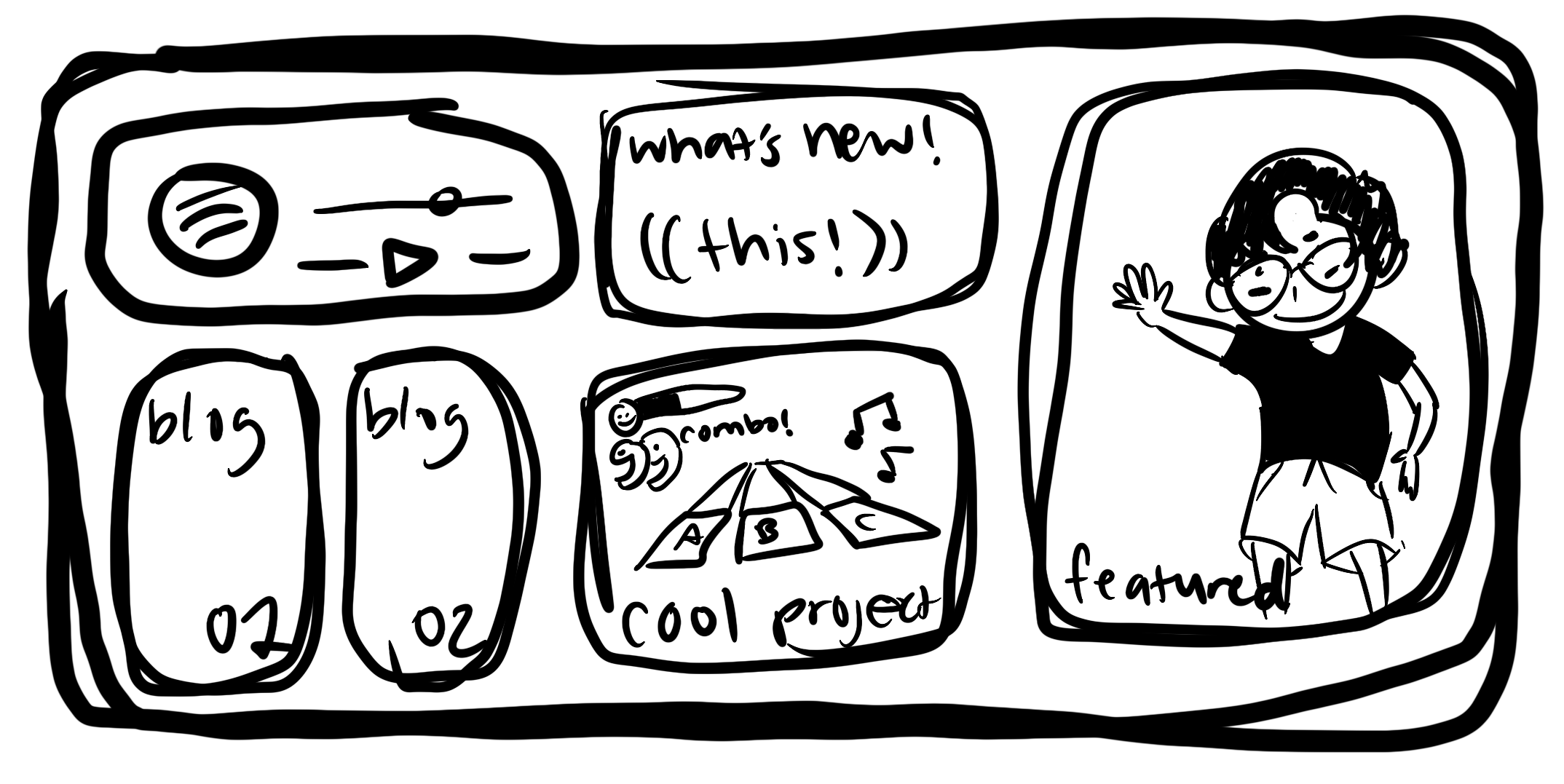
I started sketching layouts in Procreate (photos above), exploring different ways to organize content. The "bento box" metaphor clicked - separate containers for different types of content, each with its own personality but working together as a cohesive whole.
// The layout that emerged
<div className="grid grid-cols-1 lg:grid-cols-3 lg:grid-rows-2">
  {/* Left: Clock + Movie cards - Time & Entertainment */}
  {/* Middle: Latest post + Spotify - Content & Music */}
  {/* Right: About section - Personal brand */}
</div>
Design System Decisions
Typography: Inter font for everything - clean, readable, modern Colors: Primarily black and white with strategic pops of color Animations: Subtle hover effects that feel alive but not distracting Spacing: Generous whitespace to let each section breathe
The About Page: Pokemon Cards and Personal Branding
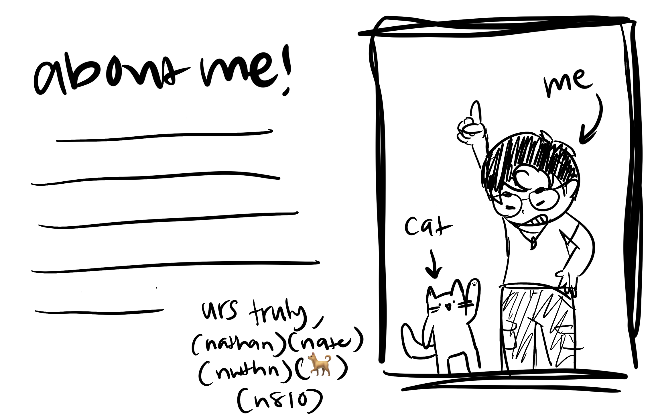
The about page needed to feel personal without being unprofessional. I wanted something that would make visitors think "this person is interesting" rather than just "this person can code."
The Pokemon card holographic effect was a perfect example of this philosophy. I found an incredible CSS implementation by simeydotme and translated it to React. Instead of a boring headshot, this interactive holographic card:
- Shows good taste - I can recognize and adapt great work when I see it
- Reveals personality - Pokemon cards are nostalgic and playful
- Invites interaction - mouse movement creates engaging effects
- Feels premium - the holographic sheen suggests attention to detail
But the real personality touch was the ticker tape at the bottom. Rather than a static "interests" list, I created a scrolling stock ticker showing my current fixations with fake percentage changes:
// Each ticker item links to actual references
<div className="ticker__item">
  <a href="https://www.youtube.com/watch?v=kpk2tdsPh0A">
    SM64 - Watch for Rolling Rocks - 0.5x A Presses (+2.36%)
  </a>
</div>
This serves multiple purposes:
- Shows my sense of humor - treating random interests like stock prices
- Provides real value - each item links to the actual thing I'm referencing
- Stays current - I can update it as my interests change
- Creates discovery - visitors find new content through my recommendations
The Art Page: Just Showing Cool Stuff
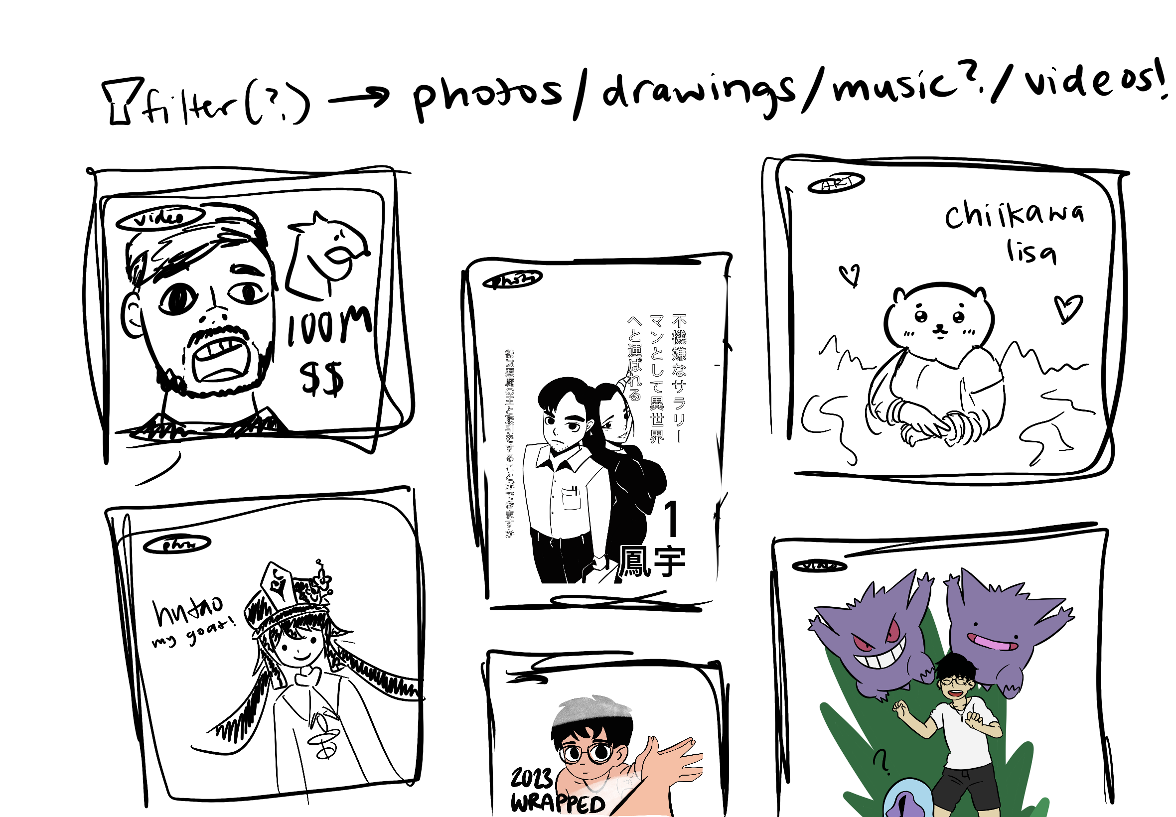
For the art section, I kept it simple. I wanted a place to dump everything I thought was cool - food photos, random art projects, YouTube videos that made me laugh. The Pinterest-style masonry layout felt right:
// Three-column masonry on desktop, single column on mobile
<div className="grid grid-cols-1 md:grid-cols-3 gap-0">
  {/* Infinite scroll because why not */}
  {artPieces.map(piece => <ArtPiece key={piece.id} />)}
</div>
The content is intentionally all over the place - nachos next to manga panels next to a video about Raising Cane's that my friends think is fake (it's not). This wasn't some grand artistic statement; I just wanted a spot for stuff that doesn't fit anywhere else but is too good not to share.
What I Learned About Design Constraints
The most helpful constraints came from the content itself:
- Clock widget needed to be immediately visible (time is universal)
- Latest post should dominate the middle (primary content)
- About section deserved prominent placement (personal branding)
- Spotify widget adds personality without being distracting
Rather than designing in a vacuum, I let the content inform the layout. This made decisions much easier.
The Technical Implementation
Once the layout was decided, Tailwind CSS made implementation surprisingly straightforward:
// Responsive grid that adapts beautifully
<div className="grid gap-4 grid-cols-1 lg:grid-cols-3 lg:grid-rows-2">
  {/* Each section gets hover effects and personality */}
  <div className="transition-all duration-300 ease-out hover:scale-105">
    {/* Content with subtle interactions */}
  </div>
</div>
The design scales from mobile to desktop naturally, with the bento boxes stacking vertically on smaller screens.
The Personality Layer
What makes the design feel uniquely mine are the small touches:
- Movie cards that tilt on hover
- Clock that changes color based on time of day
- Spotify widget that randomizes songs
- Pokemon holographic effects that respond to mouse movement
- Ticker tape with real links to my interests
- Subtle animations that make everything feel alive
These aren't just decorative - they hint at the type of content and personality visitors can expect throughout the site.
Lesson learned: Good design isn't about having unlimited options - it's about making deliberate choices that serve your content and reflect your personality. Sometimes the best way forward is to sketch first, code second. And don't be afraid to add elements that are purely fun - they're often what people remember most.
Challenge #3: Scaling Content Storage - From Git LFS to Cloud Infrastructure
As the site evolved from a simple blog to a multimedia platform, I ran into a problem that many developers face but don't anticipate: where do you store all your content when it outgrows your repository?
The Problem: Git Isn't Built for Assets
Initially, I made the classic mistake of storing images directly in my Git repository:
src/
├── app/
├── public/
│   └── images/
│       ├── art/
│       │   ├── photo1.jpg (8MB)
│       │   ├── photo2.HEIC (12MB)
│       │   └── art-collection/ (200+ files)
│       └── posts/
│           └── cover-images/ (50+ files)
This seemed fine for the first few images, but problems emerged quickly:
- Repository bloat: Git history grew massive with binary files
- Poor performance: Images weren't optimized for web delivery
- Version control chaos: Image updates created huge diffs
- Deployment issues: Vercel builds started timing out
When my repository hit 500MB, I knew I needed a real solution.
The Research Phase
I evaluated several approaches:
Option 1: Git LFS
- Pros: Keeps assets in version control
- Cons: Complex setup, limited storage, poor CDN performance
Option 2: Vercel Blob Storage
- Pros: Tight integration with hosting
- Cons: Vendor lock-in, pricing uncertainty
Option 3: Traditional CDN (Cloudflare)
- Pros: Great performance, affordable
- Cons: Manual upload process, no programmatic access
Option 4: AWS S3 + CloudFront
- Pros: Industry standard, global CDN, programmatic access
- Cons: Also vendor lock-in, but I work for AWS so... 🤷♂️
The Solution: S3 + CloudFront Architecture
Full disclosure: I chose AWS because I work there and know the services well. But it's also genuinely a solid choice - battle-tested by millions of sites and priced reasonably for personal projects.
// New image URL pattern
const oldUrl = '/images/art/photo.jpg';           // Git repo
const newUrl = 'https://images.nwthn.dev/art/photo.jpg';  // CloudFront

// S3 bucket structure
images.nwthn.dev/
├── art/
│   ├── 2021-memories.jpg
│   ├── scott-pilgrim-party.PNG
│   └── manga-wall.HEIC.jpg
└── posts/
    ├── website-plan.png
    └── cover-images/
Implementation Details
S3 Configuration:
- Bucket policy: Public read access for images
- Lifecycle rules: Automatic cleanup of old versions
CloudFront Setup:
- Custom domain: images.nwthn.dev for clean URLs
- Cache settings: Long-term caching for immutable content
- Compression: Automatic gzip/brotli for better performance
- Regional edge caches: Faster delivery worldwide
The Migration Process
Moving existing content was surprisingly straightforward:
# Upload existing images to S3
aws s3 sync public/images/ s3://images.nwthn.dev/ --recursive

# Update image references in code
find src/ -name "*.tsx" -exec sed -i 's|/images/|https://images.nwthn.dev/|g' {} +

# Remove images from git history (optional)
git filter-branch --tree-filter 'rm -rf public/images' HEAD
The Results
The transformation was immediate and dramatic:
Performance Improvements:
- Repository size: 500MB → 15MB (97% reduction)
- Image load time: 2-3 seconds → 200-400ms globally
- Build time: 2 minutes → 10 seconds
Cost Analysis:
- S3 storage: ~$0.50/month for 20GB of images
- CloudFront bandwidth: ~$0.50/month for typical traffic
- Total: ~$1/month vs. repository performance issues
Workflow Improvements
The new setup actually improved my content workflow:
// Art gallery component now references CDN directly
const artPieces = [
  {
    id: '1',
    url: 'https://images.nwthn.dev/art/2021-memories.jpg',
    title: '2021 Memories',
    description: 'just some polaroids from 2021',
  }
];
Benefits for content creation:
- Faster uploads: Direct S3 upload instead of git commits
- Better organization: Logical folder structure in S3
- Global performance: Images load fast everywhere
- Version control focus: Git history stays clean and fast
Lessons About Scaling
This experience taught me several important lessons about planning for growth:
Start with the right architecture: It's easier to build for scale from the beginning than to migrate later.
Separate concerns: Keep code in git, assets in specialized storage.
Monitor metrics: Repository size and build times are early warning signs.
Choose boring technology: S3 + CloudFront is battle-tested by millions of sites.
Cost-optimize early: $1/month beats performance problems any day.
The Bigger Picture
What started as a simple image storage problem revealed a broader truth about modern web development: the tools that work for small projects often break down as you scale. The key is recognizing when you've outgrown your current approach and having the courage to refactor before the problems become critical.
Moving to cloud storage wasn't just about solving today's problems - it set up the foundation for future growth. Now I can add video content, downloadable files, or high-resolution images without worrying about repository performance.
Lesson learned: Infrastructure decisions have compound effects. Choosing the right storage architecture early can save weeks of migration work later. And sometimes the "enterprise" solution is actually simpler and cheaper than trying to make the wrong tool work.
The Architecture Evolution
What started as a simple blog evolved into something more sophisticated:
📝 Markdown Posts → ⚛️ Next.js → 🗺️ Auto Sitemap
                             ↳ 🖼️ Open Graph Tags
                             ↳ 📊 Structured Data
                             ↳ 📡 RSS Feed

🌐 Squarespace DNS → ☁️ CloudFront CDN → 👤 Users
📦 AWS S3 Images ↗

🚀 Vercel Platform → 📊 Analytics + ⚡ Performance Monitoring
The beauty is that adding a new blog post automatically:
- Updates the sitemap
- Generates rich social media previews
- Creates structured data for search engines
- Adds the post to the RSS feed
All from a simple markdown file in the _posts directory.
Technical Decisions and Trade-offs
Choosing Simplicity Over Complexity
I could have used a headless CMS, but markdown files in git gave me:
- Version control for content
- No vendor lock-in
- Lightning-fast builds
- Developer-friendly workflow
Balancing Performance and Features
Rather than avoiding "heavy" libraries like Three.js, I learned to use them smartly:
- Route-based code splitting keeps pages lean
- Dynamic imports load features on demand
- Proper cleanup prevents memory leaks
Prioritizing Developer Experience
Every technical choice was evaluated on: "Will this make development more enjoyable?"
- TypeScript for confident refactoring
- Tailwind for rapid styling
- Hot reload for instant feedback
- Vercel Analytics for zero-config insights
What's Next
The foundation is solid, but there's always more to build:
- Three.js showcase for creative coding experiments (coming soon!)
- Interactive data visualizations
- More sophisticated animations with Framer Motion
- Performance optimizations as traffic grows
Key Takeaways
- Start simple, evolve thoughtfully — Don't over-engineer from day one
- Performance is about smart loading — Not avoiding powerful tools
- SEO is about digital professionalism — Not just search rankings
- Developer experience matters — You'll iterate faster with good tools
- Modern web platforms are incredibly powerful — Vercel + Next.js handles so much automatically
Building this website reminded me why I love web development. Every challenge was an opportunity to learn something new, and the end result feels both technically solid and uniquely mine.
The best part? It's just the beginning. Now I have a platform to experiment, share ideas, and showcase the weird projects that come from 3 AM coding sessions.
Cheers,